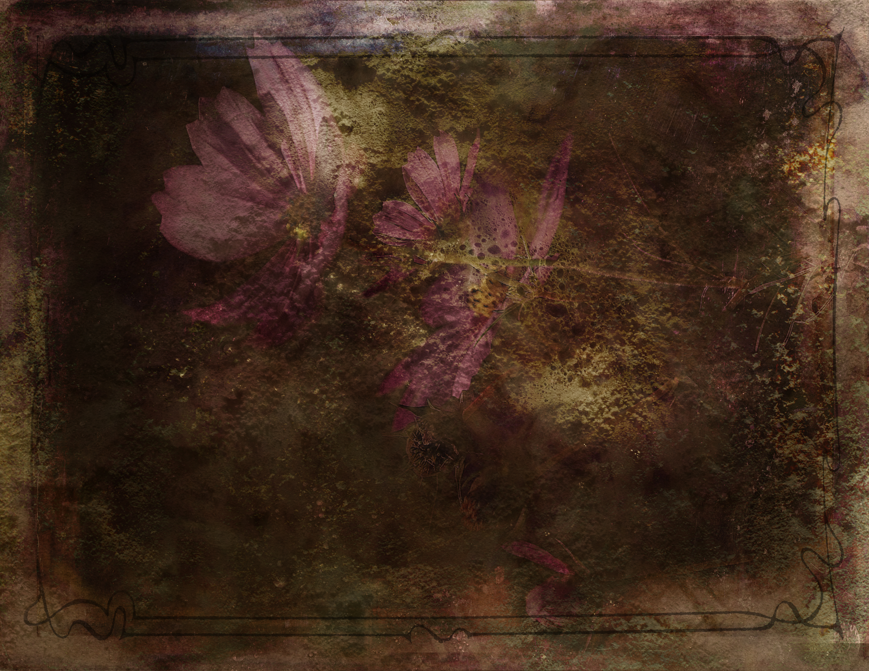
In A Fog…so to speak

Posted in Uncategorized with tags , , , , , , , , , , , on February 8, 2010 by Eldon

Hi everyone, welcome back to my blog. It’s good to be painting again. I had laid off for a while but now I’m back with a vengeance. The piece below, a 16×20, is my latest. I used an old photo from Rocky Mountain National Park for reference and after a few minor (uh huh) changes this is what shook out. I believe it’s finished. Yeah right. I once worked on a painting for 5 years. It was nice tho and a good friend of mine gave it a home on his living room wall. This one will end up on the gallery wall soon.

The palette was limited.  Ultramarine Blue, Cobalt Blue for the foggy background, Cad Yellow and  Cad Orange mixed in the greens, Yellow Ochre, White and Black. Oh, and some Sap Green.  Maybe not so limited after all. I posted a sorta progression on my Facebook wall. If any of you on Facebook would like to have a look please feel free. I’ve been goofin around in there for about three days and all I can say is so far so good. It’s different. Not much more than a glorified Twitter, I think, but it’s fun hookin up with folks.

Anyway, this piece is available. If anyone is interested contact me through the blog or my Facebook thang.

Well, back to work!!

EW

These Two Guys….

Posted in Uncategorized on December 17, 2009 by Eldon

My friend Peggy says I’ve been neglecting my blog.

She’s right. (somebody has to keep an eye me  ) I put these two progressions (of sorts) in a couple of weeks ago then found I wasn’t feeling particularly talkative so I let them sit for a while. They are both do overs. The piece on the left is a do over of a painting I’d done a ton of years ago and had given to my daughter. She claims it’s her favorite so it wasn’t real easy to talk her into letting me bring it home with me for a while so I could do this other one.

Below (the gray one) is the original. Both are 16×20 inches. Or 20×16 I guess.

I don’t know that one is better than the other. You be the judge, I kinda like em both.

The other is a re-do of a much more recent painting. Some of you will remember it from a few weeks ago. In this case I believe the second is a better piece than the first.

Why?   This piece above is a 7×5 inch painting which dictated smaller shapes of color and/or value. Smaller shapes equate to less expressive brush work and simpler form. The color is also quite a bit stronger in the second piece. I also like the face being longer and narrower. I don’t know if that in itself makes a better painting. Probably a personal thing.  Huh? And aint that a hell of a ceegar?

At any rate this gesture portrait thing is making headway. I’ve taken a few of these to Stoneheart Gallery to see how folks are going to react. Cross yer fingers. When you’re in the Stoneheart site click on STONEHEART SPOT 2.

EW

Pink Slip

Posted in Uncategorized on November 29, 2009 by Eldon

Well ladies and gentlemen. Looks like I  join the ranks of millions of other out of work Americans. There’s a little work to finish up Monday morning then it’s on to a long long holiday.

Two things about that. It’s good and it’s bad. It’s good I get to paint more and have the rest I’ve needed for quite a while. It’s bad I have to tighten my belt (probably should anyway) and deplete a savings I’ve been a long time building.(that sucks)

Oh well.  As they say:

That’s the way it goes, first your money then your clothes. :)

Above is the piece I worked on over the Thanksgiving weekend. It was one of those pieces that fell together and made time cease to exist. Hours later seemed like minutes and I only had to wipe off a tiny bit  for do overs. I worked from a photograph taken in Rocky mountain National Park a couple of years ago. The photo is of my stand of trees in Endo Valley. I reversed the image before painting.

And this next one is a progression, sort of.

There are similarities to the composition of the snow scene and is heavily under the influence of a new palette.

I wasn’t kidding when I said it was a “sort of” progression. :)

Night all, stay tuned!!

EW

And Black

Posted in Uncategorized with tags , , , , , , , on November 21, 2009 by Eldon

Alright, I added black to my palette. There!  In addition to those other new colors  mentioned last week I’ve also added black.  I know, I know, ya never use black. “You can mix GREAT! darks with out using black”.  Right?    Right!.   But one can mix great darks using it too. Sargent used it. Velazquez used it. David Leffel uses it. Jeff Watts uses it.

And boy oh boy does Jeff Watts use it! I may be overstating  just a bit but sometimes it seems like every other trip to the palette finds Jeff digging into that huge pile of black. Jeff also puts his black right next to the white and normally has a little bit of gray mixed in between the two.

The detail above is from a 5×7 inch piece I did the other night. That dark color is mixed using black and bright red. Almost edible. It’s a combination I see Jeff using all the time and I did this little painting just so I could mix some of it.

I’ve watched, over and over again, Jeff ’s Gesture Portrait  video. I’m trying very hard to emulate what I see him doing.  As best I can I use the same tools, color, brush work etc. so I can more readily get a feel for what he’s doing and his thought process. It’s working. I’m having a great time and I can already see it coming around to my way of application. As it should I suppose.

A huge perk from doing these things is the mixing of new color I’ve not gotten into before. Flesh tones intimidate me. At least they did until recently when I heard Mr. Watts describe the process. He says mixing flesh tones “is the easiest thing” in the world to do. Red, yellow and white. Any Red, any Yellow and White. I’d never heard it said. Go figure.

He’s right. It’s pretty easy.

Happy days!!

EW

And down the road we go.

Posted in Uncategorized on November 15, 2009 by Eldon

This painting was done from a photo I took last year in S.E. Colorado. It’s near mesa De Maya and Willard Loudens place. I liked the view down the road and the distance. Beautiful country indeed.

12x16 oil on canvas

My palette has changed a little since starting work on the gesture portraits. It was very simple before and even with the addition of some new color is still pretty simple.

The before: Titanium White, cadmium yellow pale, cadmium orange, bright red, ultramarine blue, sap green, yellow ochre pale, burnt sienna.

The after:    Titanium white, cadmium yellow deep, cadmium yellow pale, cadmium orange, bright red, alizarin crimson permanent, ultramarine blue, cobalt blue, sap green, yellow ochre pale, burnt sienna.

12x16 #2

Basically what I’ve added is  another yellow, another  red and another blue. Cadmium yellow deep is a warm yellow while the cadmium yellow pale is the cooler of the two. Bright red is the warmer of the two reds and ultramarine blue is the warmer of the two blues. I’ve considered for a while adding enough new color so I’d have a warm and a cool in each of the primaries. Finally I had an excuse to do it and I am finding I like how it’s working.

#3

What it’ll do tho is change the color a little in my landscapes. I’m thinking so far I can use the same palette for both the landscapes and the portraits and get away with it just fine.

#4

This piece seems to have started the way most of my painting start. Middle distance goes in first. (see #2 above)

#5

Next I moved to the top of the painting. (see #3 above)

#6

And painted back down the canvas into the foreground.

#7

And of course the hard part goes in last.  Go figure. I don’t know how many times  I attempted to paint that darn truck. I suppose I could call this stage of the painting the “paint and wipe” stage. But….. after a while there appeared a pick up truck I could live with and the piece felt  finished.

The Bronco game is calling me.

Happy days!

EW

Triple Stack

Posted in Uncategorized with tags , , , , , , , , , , on November 8, 2009 by Eldon

I saw this approach on another blog a few days ago where the artist cropped an image and then blew up the crop. She did it a couple of times until anyone looking at the piece got a close up of part of the original painting. What I got from it was a chance to get nearly nose to nose with some of the brush strokes in important areas. Neat idea. So here is my version to get you up close.

12x9 oil on canvas

This image took me  a while longer than the half hour Jeff Watts takes to do his “gesture portraits”. I suppose in time I’ll be coming in closer to that time but for now all that seems important is getting a feel for what I’m doing, then getting my times down later. That and I don’t want a bunch of half finished paintings cluttering the place up.

detail

A little more in your face and giving you a better idea of the surface of the painting and the brush work. This piece is pretty rough. The paint was applied with an old cheap brush giving each stroke a sort of stringy textured appearance.

detail

Some of you may have a way to blow this view up even further. If you can, give it a shot and see the abstract quality of a very small area. It gets kind of chicken scratchy at that point. Have fun and we’ll see ya next week. Who knows what will crop up between now and then.

EW

Don’t Confuse Em

Posted in Uncategorized with tags , , , , , , , , on November 1, 2009 by Eldon

That’s what they tell me. “Don’t confuse them!” What they’re tryin to tell me is “Stick to the landscapes, everyone already knows yer landscapes.” I guess if I throw something else in the mix I’m gonna confuse everybody. Folks are gonna walk away scratchin their heads mutterin something about how confused they are and Geez Louise! that Eldon has gone like totally nuts. Well Nuts is as Nuts does.  :)

I can’t believe anybody followin my stuff is that soft headed. So……….I’ve taken to the task of learning this portrait thing and I’m gonna post at least a few of em. The painting below is  7×5 inches and it took me about 45 minutes.

5x7 gesture portrait

A little while back I purchased a video by Jeff Watts. Jeff demonstrates what he calls “Gesture Portraits”. He gives himself a half hour or so to paint a small gesture of someones face not worrying about a likeness but getting the essence of his subject onto the canvas and of course making it look way easy.  He’s good at it.  He demos nine little paintings that are totally beautiful. It seems in the video he is working from photos as all we get to see of the model is a still photograph. There is something caricature like about all nine of his paintings. Each subject has his/her own peculiar props and he seems to endow each of them with their own quirky little personality. And as such I’m not sure I’d go 100% with the gesture portrait title.  Caricature may be more like it. (personal opinion)

The piece below is 16×12 inches. It’s a little big for a gesture portrait and I set no time limit so I  don’t believe it really falls into the gesture category. It’s a pretty nice piece tho. It’s done from a photo I took of a little girl at the quick draw in Estes Park a couple of years ago.

16x12 oil on canvas

Still….no matter what ya call it I find what he’s doing hugely exciting.  There’s nothin stuffy about these lively, energetic gestures so I’m going to follow his lead and see if I can learn something that’ll translate into something that looks like Eldon Warren did it. So far so good! This post contains the first couple for me. Cross yer fingers that this gets easier.

EW

A Progression

Posted in Uncategorized with tags , , , , , , , , , , , , , , , , on October 25, 2009 by Eldon

12x24 oil on canvas

This is the start of a landscape I’ve been trying to get to for a while.

What I concentrated on most with the upper area was painting space and getting the landscape to go as far into the distance as I could get it to go. I began with the darks of the pine trees close up and painted them lighter and a little more gray as they went back into the picture plane. Beyond that, in the row of trees further back and the hill sides, I painted with a lot less detail and a lot of grayed color to keep things going away into the distance. I brushed in the sky and clouds even more pale  but fairly light as the sky in that area holds the light source for this piece.

Then I pulled back and painted the brush along the river banks. The color here is warmer and I’ll keep painting warm as I get back closer to the foreground. The red/brown shadows of the pine tree are my first intrusion into this area.

12x24 oil on canvas 100_4250

This bright blue (cobalt + white) area in the water is warmed with a bit of alizarine crimson and brushed in pretty quickly. This passage is going to give me something to paint into (wet into wet) with some of the sky color a little later.

I also darkened those shadows on the water cast by the pine trees. The light source is behind the trees and the trees are casting a shadow onto the water. When the light source is directly behind an object, in this case the pine trees, a shadow is cast into the foreground. The shadows cast on to  water blocks a reflection from the sky and lets someone from this point of view see down into the water to the bottom of the river bed. The color here seems to be very warm and rusty. Also I laid in the foliage lower right keeping the same concept in mind of warmer color up front, cooler in the distance.

12x24 oilon canvas 100_4252

Here is where I began painting wet, lighter color into the water. I’ve also started painting in some reflections and color from the sky. The shadows on the water were a little hard edged so I took this opportunity to soften edges and get them to become more a part of the surface of the water.

12x24 oil on canvas 100_4253

Next the base color for the sand bar. I’ll use this base like I did the blue in the water. I’ll paint back into it wet in wet and develope the textures and shapes of the rocks in that area.

detail 100_4254

detail 100_4255

detail 100_4256

The above three details show how I worked my way across the sand bar. Up close it simply looks a little lacy but takes on shape and detail as the viewer gets further away from the piece. I used a round to do the detail in this are. (I’ve only recently found that a flat isn’t the only brush in the world.)

12x24 oil on canvas 100_4264

Now the painting is more or less complete. I’ve finished the sand bar and placed a few details in the trees such as the trunks and a few branches. The trunks on the left and close up are warmer and a little more distinct than those on the right. My center of interest was put in last.

Happy Daize!!

EW

Druuuuum Rolllll!!!!!

Posted in Uncategorized with tags , , , , , , , , on October 25, 2009 by Eldon

Introducing!!   Debra!

And what she does when she’s being creative.

debrawire wrap

wire wrap

Debra is my wonderful wife. One of her favorite pass times and method of relaxing is to do wire wrap jewelry. She’s been doing it for about five years now and is getting pretty dang good. Most of the time she uses copper or silver wire to wrap anything from glass beads to semi precious stones. She buys the stones already finished and puts a nice wire wrap design on it. The pink stone above is a died stone and the necklace portion is made with pearls, lapiz and died shell.

And she digs tools.

And on the American Impressionist Society front Mitch Baird won Best of show!!   AIS <—– This is a link to the online catalog. Congratulations Mitch!  His piece, “Morning Ensigns, Italy” is one heck of a painting. The judging must have been tough because there was a lot of really great work. Scroll down a ways in the catalog to see my personal favorite “Coyote Valley” by Nancy MacDonald.     Sweet!

I’m working on a piece right now that I’ve been photographing as I go. I’ll post a progression as soon it’s finished. It’s about there so it won’t be too long. Perhaps tomorrow.

Later!  :)

EW

American Impressionist Society

Posted in Uncategorized with tags , , , , , , , , , , , , , on October 16, 2009 by Eldon

Hey! The American Impressionist Society show is being held in Denver this year at Saks Galleries. I managed to sneak one in and delivered it today. The opening is this next Friday, Oct. 23rd from 5 to 8 p.m. The location is:  Saks Galleries, 3019 E. 2nd Ave, Denver, Colorado. I know all the folks around here close have seen my stuff already but beyond that it would be a great opportunity to see some of the best impressionist work from around the country. There were nearly 700 entries and 189 pieces were juried in so the show is no doubt going to be a good one. So….. I’m looking forward to seeing a bunch of you locals and near locals at the show. Quang Ho is judging.

For all of you but  especially for those way outta town the link above will take you to the Saks Galleries web site. In the lower left corner of the opening page is a big white dot with the letters AIS inside.   Click on that for a preview of the entire show. I’m impressed.

And below, offered as a bit of proof that I’m getting back on my feet after surgery and getting something done in the studio are a couple of paintings. One is a plein air that kinda went south the day I did it and the other is a remake of it  I think to be nearly finished.

First (some of you may remember this one from an earlier post) the not so great plein air:

12x16 oil on canvas

And following is the 18×24 piece done from the plein air.

18x24 oil on canvas

A big improvement so I guess the time spent in the field wasn’t a waste. The original had a couple of people in it so I put them in here as a matter of following my own lead. I’m not sure though if they are actually right for this piece. What I’m thinking of is to paint them out and place in a few cows instead. There’s something peaceful (for me at least) about looking into a pasture and seeing a few cows just grazing away, quiet, no cares, no hurry, nothing but time. And the evening is my favorite time of day.

EW